Responsive Design Explained
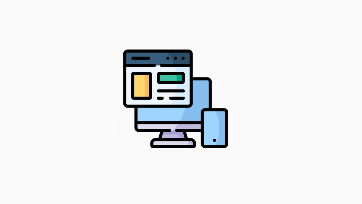
Responsive design is one approach to web design that allows a site to be viewed on any device, regardless of its size or resolution.
It accomplishes this by using flexible grids, layouts, and images that respond to the screen size of the device being used. This makes for a better user experience, as the site will automatically adjust to fit the screen without any resizing or scrolling required. Responsive design can be used for both static and dynamic content. It is becoming an increasingly popular approach due to today’s devices and screen sizes growing.
How does it work?
Responsive design is a web design technique that allows a website to respond to the size of the screen it is being viewed on. The website’s layout changes to fit the screen size, making it easy to read and use on any device, from desktop computers to smartphones and tablets.
Responsive design has become increasingly popular in recent years as more and more people use their smartphones and tablets to access the internet. By using responsive design, businesses can ensure that their website looks great no matter what device it is viewed on.
There are a number of different ways to create a responsive website. One popular method is called “responsive grid design.” With responsive grid design, websites are built with columns and rows that can be rearranged depending on the screen size.
The benefits of responsive design
As the use of mobile devices increases, so does the need for websites to be responsive. In fact, according to a study by Google, 61% of users are unlikely to return to a website that’s not mobile-friendly. That’s why responsive design is so important.
A responsive website automatically adapts to the screen size of the device being used, whether it’s a desktop computer, laptop, phone, or tablet. This means that no matter what device a user is on, they will have an optimal viewing experience.
Responsive design makes a website look better on different devices and makes it easier to navigate. The layout changes automatically based on the screen size, so there’s no need for users to zoom in and out or scroll back and forth to see everything on the page.
Examples of responsive design in action
There are many different ways to make a website responsive. All of them use a combination of media queries and fluid grids. Here are some examples of responsive design in action.
The first example is the website for The Guardian. It uses a fluid grid with percentage values for widths and heights. This ensures that the layout will look good on any device, from desktop computer to mobile phone.
The second example is the website for Google Maps. It uses media queries to detect the size of the screen and then adjust the layout accordingly. For smaller screens, such as phones, it switches to a simplified layout with fewer buttons and more text.
The third example is the website for Apple Music. It uses media queries to detect the screen size and orientation (vertical or horizontal). It switches to a simplified layout with fewer buttons and more text for smaller screens.
Why responsive design is important
Responsive design is important because it ensures that a website is accessible and usable for all users, regardless of their device or screen size. This is crucial for businesses and organizations that want to provide a positive user experience.
Additionally, responsive design can help to improve SEO rankings since search engines prefer websites that are easy to navigate and load quickly. So if you’re looking to improve your website’s usability and SEO, responsive design is the way to go.